

OVERVIEW
-
5-day modified Google design sprint for the company House & Home Elements.
-
Users want to decorate their apartment or house but don’t have a lot of time or a big budget. Additionally, these are often rentals so people cannot make major changes, such as painting or remodeling or even installing large items.
Many users are unsure how to choose a look or don’t know what would look good. Those people interviewed that do have some idea of the look they want to achieve, are still unsure how items might look in their own homes.
Possible Obstacles:
Budget
Time
Unsure what to choose
Renting & Can’t make major changes
How will things look in their own homes?
-
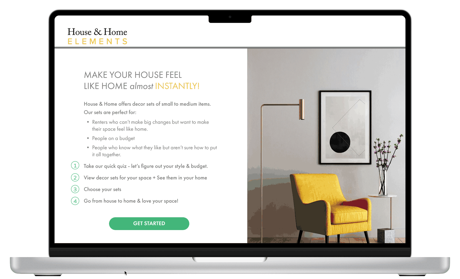
Give people the option of a starter kit of items that will instantly decorate the user’s new place.
-
House & Home Elements is an e-commerce website that sells home decor items and accessories such as prints & posters, lighting, and small accent pieces.
-
Sketchpad, whiteboard, stickies
Figma
Google docs and forms
-
Offer options based on users’ budgets
Inspire confidence in users’ ability to choose options that will fit their homes
Make the process relatively quick and simple
Allow users to “try out” options to see how the will look before committing or purchasing
Offer options that don’t require permanent change
DAY 1: UNDERSTAND & MAP
Sketching the Problem

2. Defining a Persona

3. End-to-End Experience Map
For the optional item (step 4 in this map) I had planned to offer a virtual experience of seeing the items in your home before purchasing. I decided this would come later, so it didn’t make it into the MVP plan.

DAY 2: SKETCHING A SOLUTION
LIGHTNING DEMOS
The Spruce
This site is great for people who are looking for inspiration and ideas with links to where to purchase, however they don’t sell any products themselves.
The inspiration aspect would be nice to have in my solution, but it must also make it easy to buy directly.

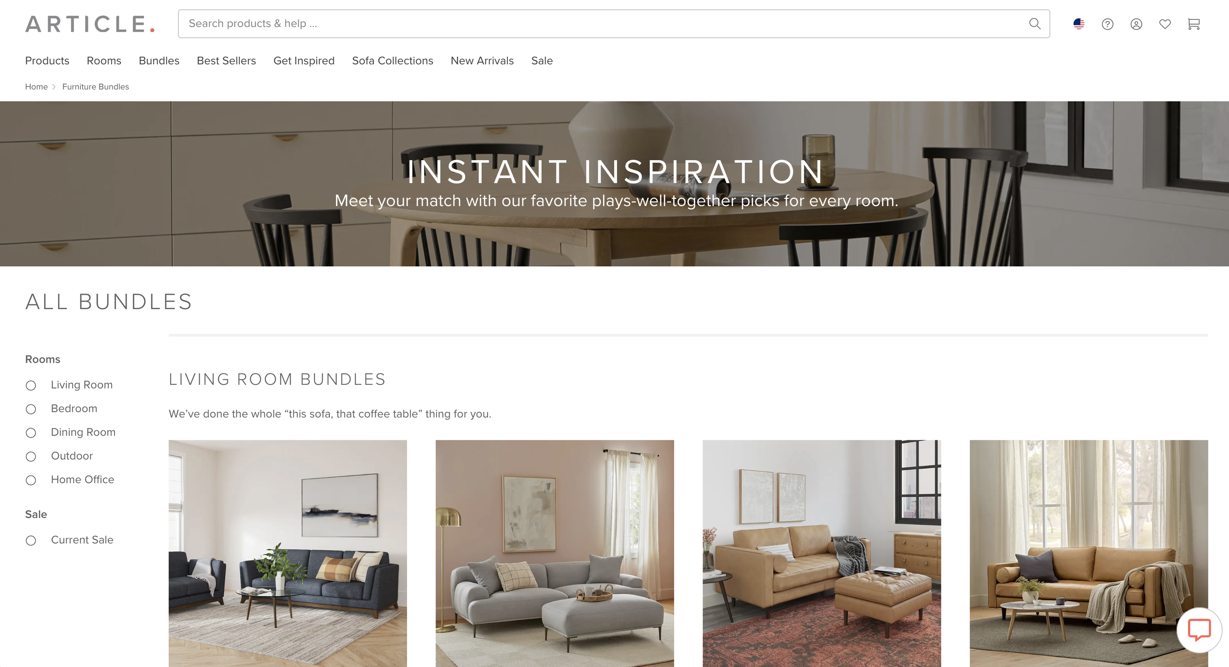
Article
Article features decor bundles by room, which is exactly what I’m looking to do for House & Home. However, House & Home will feature smaller items as they don’t sell furniture or larger items.
NestSet
This is a web-based shop that allows a person to choose by aesthetic and color - all of which I envision for House2Home. However, in NestSet there’s no ability to take a style quiz or to see how the products will look in one’s home.

Havenly
This site has a great quiz for discovering one’s design style

CRAZY 8s
I selected this portion of the problem and ultimately this screen, in order to work out the problem of how to allow people to do an effective search or survey of their needs - I ended up at a simplified quiz idea by the last sketch.

IMPORTANT LEARNING FROM DAY 2
Though I sketched a virtual reality component into my user experience map, I’ve concluded that would be a feature for project round 2, and not for the MVP as it’s a complex challenge, especially in addition to the detailed style quiz I want to include.
I didn’t see this as an option on any of the decor sites I visited, though it is a more common feature in design apps where larger changes are being made or are being carried out by professionals.
THE SOLUTION SKETCH
This solution sketch shows the simplified quiz option I finally decided on and how the user might navigate through the first three screens.

DAY 3: DECIDE & CREATE A STORYBOARD
Originally I wanted to start with a quiz to help the user find the style that really suits them, and then have them choose a budget, what they wanted to decorate, etc. and then allow them to try out how kits would look in virtual reality in their space.
I decided that was too ambitious for the MVP of this solution, but could happen in a second or subsequent iteration.
I wanted to keep the style finder quiz - as this goes a long way toward solving the problem identified on day 1 - “I don’t know what to choose” and “how do I know once I choose a bunch of items online they’ll look good in my space?” Additionally, selling decor kits or sets rather than single items cuts out a lot of work for the user of trying to decide how to put things together.
In order to greatly simplify the process, I decide to ask the user to input all of the most critical info to find them a kit all on the first page and then begin to show them a list of options and other kits that will complement the main choice.
STORYBOARD
You’ll see in the storyboard that I decided the quiz inputs shouldn’t happen right on the homepage, as I’d originally thought. I needed to have a homepage that would feel welcoming first, and then dive into the quiz later.
click image to view detail
DAY 4: PROTOTYPING A SOLUTION
Once I got into the process of making a high fidelity prototype, I realized the company’s value proposition needed to be explained, and that the quiz should be broken up into two pages, unlike what I layed out in the wireframes.
I also discovered that a full ecommerce site that functions fully in testing with users is time-consuming, so I took a couple shortcuts in terms of functionality, so I could spend more time mocking up how this should actually look. As the commodity of this company is at least 90% visual, I couldn’t afford to skimp on the aesthetics.
DAY 5: VALIDATE
I interviewed 5 users - 2 men and 3 women ages 17-40 who are currently in the place of decorating a new space, have done so recently or will want to decorate soon.
User 1: Elisa, College Student, age 21
In Elisa’s session I discovered that it would be useful to understand more about what the company is trying to deliver up-front, which lead me to edit the homepage description & quiz instructions. Otherwise she made it through the tasks without any critical issues.
User 2: Wendy, Illustrator & Designer, age 28
Wendy had excellent feedback about the process - for example she explained that she would never just buy a decor set by looking at an image of a grouping of items. She wanted to select a set, and then see a list with images of the individual items before making a final decision.
User 3: Nani, new College Student, age 17
Nani felt that the interface design was clean and clear, but she felt that she would need to see more styling ideas and options than what she saw in this prototype, in order to purchase the products.
User 4: Patrick, single dad & Therapist, age 38
Patrick loved the style and felt like the company’s mission and way of offering products would work well for him once all of the possibilities on offer are built out. He made it through the tasks without issues.
User 5: Daniel, Health Practitioner, age 40
Daniel identifies as the kind of guy that is very minimal and had never even considered decorating with new items. He stated that he normally just uses what he already has when he moves into a new place.


TAKEAWAY FROM MY SPRINT
The most interesting aspect of this project, was discovering how much ground I could cover, on my own, in just five days.
With a team I can see how productive a design sprint can be, and I look forward to future sprints!